A new version of Dwarf Fortress was released last week, and it was all the incentive I needed to start playing again. I suck at DF, but I love that game: it savantly combines depth and complete wackiness and the old-school look-and-feel certainly appeals to me. Yet, I think that the game has (at least) one huge flaw: its menu system makes ed(1) look positively user-friendly by comparison.
There are a lot of tasks that one can perform in Dwarf Fortress: select regions to be dug, build all kinds of shops and accessories, manage a militia, etc. All these tasks are accessed with the keyboard by navigating through menus. Consider for instance the Build main menu:
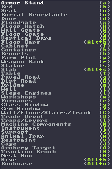
A few of the idiosyncracies of this menu:
- The items are not ordered alphabetically nor grouped into related tasks, so if you are new (or haven’t played in a while), you need to read the entire list to find what you want.
- A menu item and its hotkeys don’t necessarily match. For instance, seat has the shortcut c (for chair presumably) and the C of Wall/Floor/Stairs/Track is for Construct.
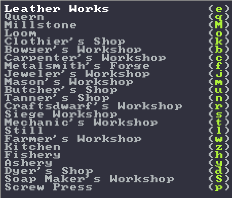
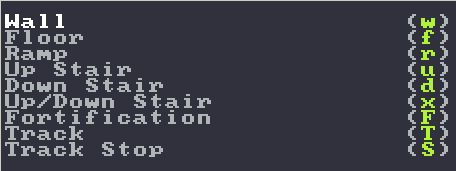
- You can’t tell just by looking at it, but some of the items in that menu open sub-menus, e.g., Workshops and Wall/Floor/Stairs/Track. When hunting for a task to perform, you could read all the items in a menu without finding what you’re looking for and not having a clue that you were on the right track.
Looking into those two sub-menus, we see the same idiosyncracies from before: unordered items and unrelated keyboard shortcuts. Also, why is floor in a sub-menu, but floor hatch is in the primary menu?
 |
 |
Tarn Adams, the main developer of Dwarf Fortress, has said that he has very little interest in making the menus better as he constantly adds and removes items. Still I wonder, would it be possible to make the Dwarf Fortress interface better with little development overhead? I think that ivy, a GNU Emacs package, provides an attractive solution to the problem.
Ivy is a completion and narrowing framework; it replaces Emacs’ default auto-completion with a system that is much more powerful. When the user needs to enter an information that can be completed, ivy will show all the possibilites, and the user can navigate this list or type to narrow down the list of possibilities. For example, here is ivy showing the files managed by git in a project of mine:
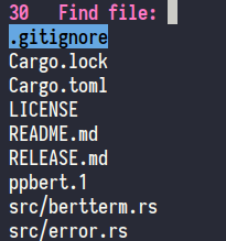
I can use the up/down and PageUp/PageDown keys to move the selected element. I can also type in a fragment to narrow down the list:
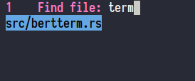
In the screenshot above, I typed term and I now have only one result left. Pressing Enter will open the file.
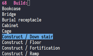
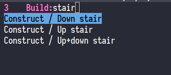
Thanks to ivy’s integration with Emacs and with external tools (git, grep, etc.), a user can quickly find and jump to anything they want: a file, a function, a man page, a search string, etc. This kind of design would work quite well in Dwarf Fortress: rather than searching haphazardly in a menu, the player could open up a small window, enter a substring, and quickly select the action he wants to perform.
I used ivy to mock what such a system would look like:
 |
 |
And you know who else thinks this type of interface is a good idea? Tarn Adams himself. Indeed, there are some screens in Dwarf Fortress with this exact interface! The management screen allows the player to efficiently issue orders (e.g., Construct 10 wooden barrels). The management screen contains hundreds of tasks—the screenshot below shows what the screen looks like when it is first accessed—and so a filtering interface is ideal.

The management screen after typing wood bar:

Tarn Adams probably wants to focus on the magic system (yes!!) and the code of Dwarf Fortress is closed, however the community is dedicated enough that people have created tools to interact with Dwarf Fortress (e.g., Dwarf Therapist) and also improve Dwarf Fortress itself (DFHack). Perhaps a motivated hacker will attempt to improve the UI by leveraging the search+narrow framework already inside Dwarf Fortress.