The purpose of syntax highlighting is to draw attention to certain parts of the code: it helps us to identify when a comment or a string literal is not properly terminated, when a keyword is misspelled, or when an escape sequence is invalid. Lately, I find that editors colorize too many elements and use too many colors. (This is a recently-acquired annoyance; maybe age and worse eyesight have something to do with it?) When every syntactic construct is highlighted, none of them jumps out, and doesn’t that defeat the purpose?
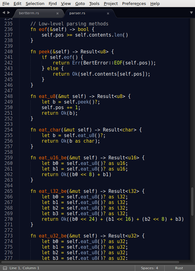
Take a look at the screenshot of Sublime Text below; I find it difficult to focus on anything, too much is highlighted.

Some programmers have written about turning off syntax highlighting entirely, but this is too extreme for me. In the TeXBook (p.13), Don Knuth gives this advice to the reader about special typefaces:
Special fonts are effective for emphasis, but not for sustained reading; your eyes would tire if long portions of this manual were entirely set in a bold or slanted or italic face. Therefore roman type accounts for the bulk of most typeset material.
Too many colors—as is common in programming text editors—is not ideal, but neither is a competely barren buffer. A book that exclusively used Times New Roman 10pt would be extremely difficult to read. Moderation is key.
I tried many Emacs themes over the years, and we are lucky to have a large collection of well-designed themes. If you don’t mind a lot of colors, the material themes are quite nice.
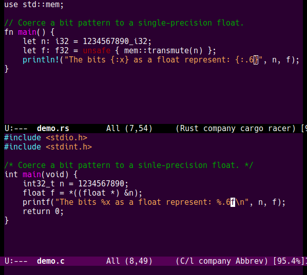
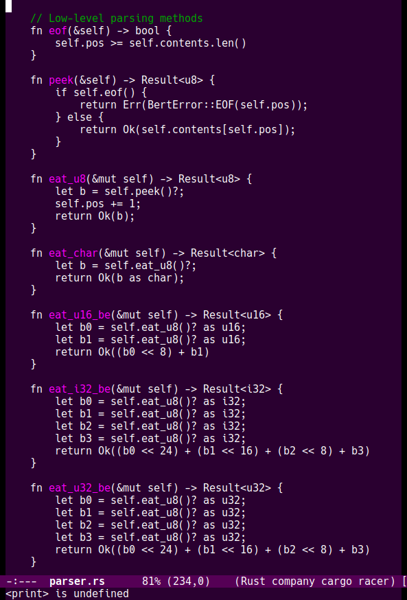
However, since I couldn’t find one that used only a few colors, I decided to build my own, Purp. It’s not too hard to do in Emacs, and there are plenty of open-source themes that one can use for inspiration and education. In Purp, I tried to minimize the number of colors and the number of elements that are highlighted. You can see the result in the screenshots below.


I consider that the following elements are important enough to have their own color:
- String and character literals: I want to know if they are properly terminated;
- Comments: I want to find them quickly, and in languages that don’t have nested comments, syntax highlighting will show when you made an error;
- Function names: a theme called Dracula gives function names a bright color and I find that it helps me identify where a function begins better than the indentation does, so I stole the idea;
- Pre-processor commands: these are often not subject to the same rules as the base language and I wanted to see them easily;
- Warnings: some language modes (e.g., Rust) use this face to identify dangerous constructs, so it’s not a bad idea to make sure they are visible.
Everything else uses the default typeface. I think the code looks much “calmer” than it did in the Sublime screenshot.
Purp isn’t publicly available yet, because there’s still a lot of work left to do. My installation of Emacs defines 418 faces (org mode has 75), but I’ve only defined colors for 25 of those.